MD Perfect
Medical Center
Building brand identity & website from the scratch.
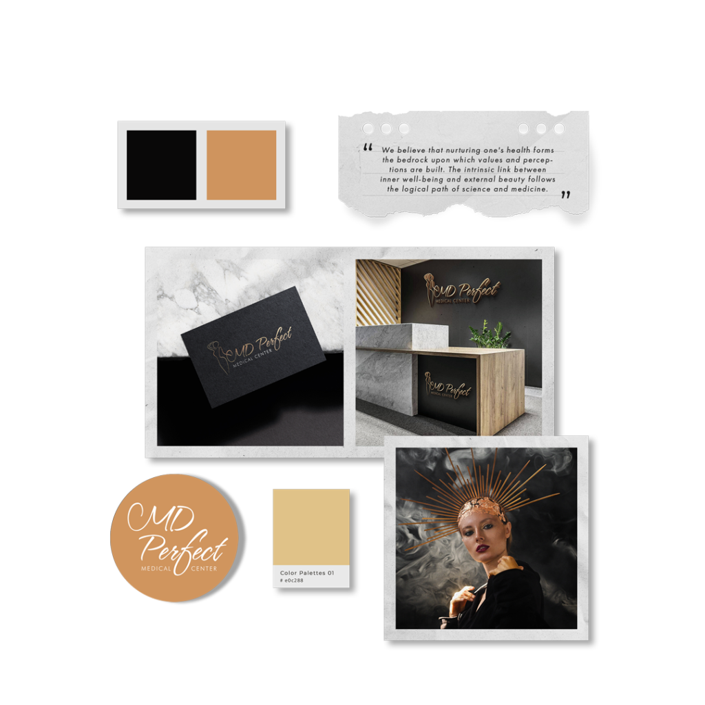
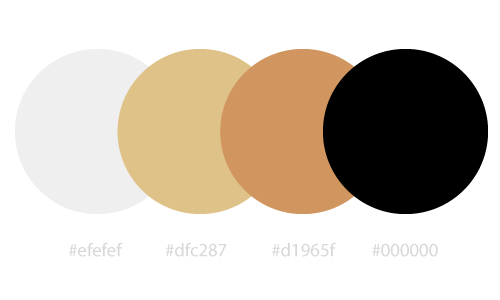
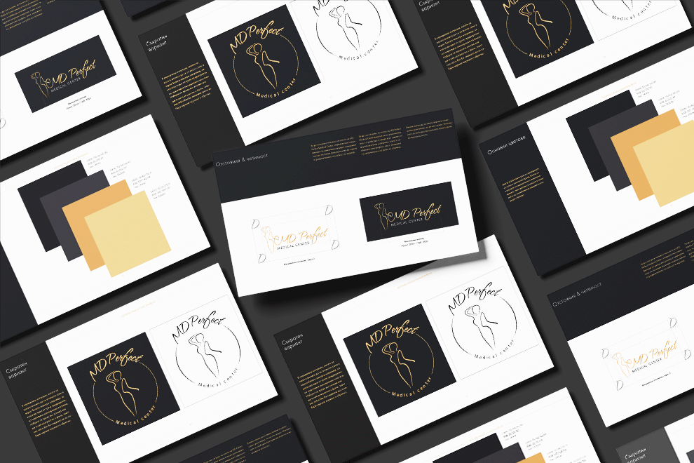
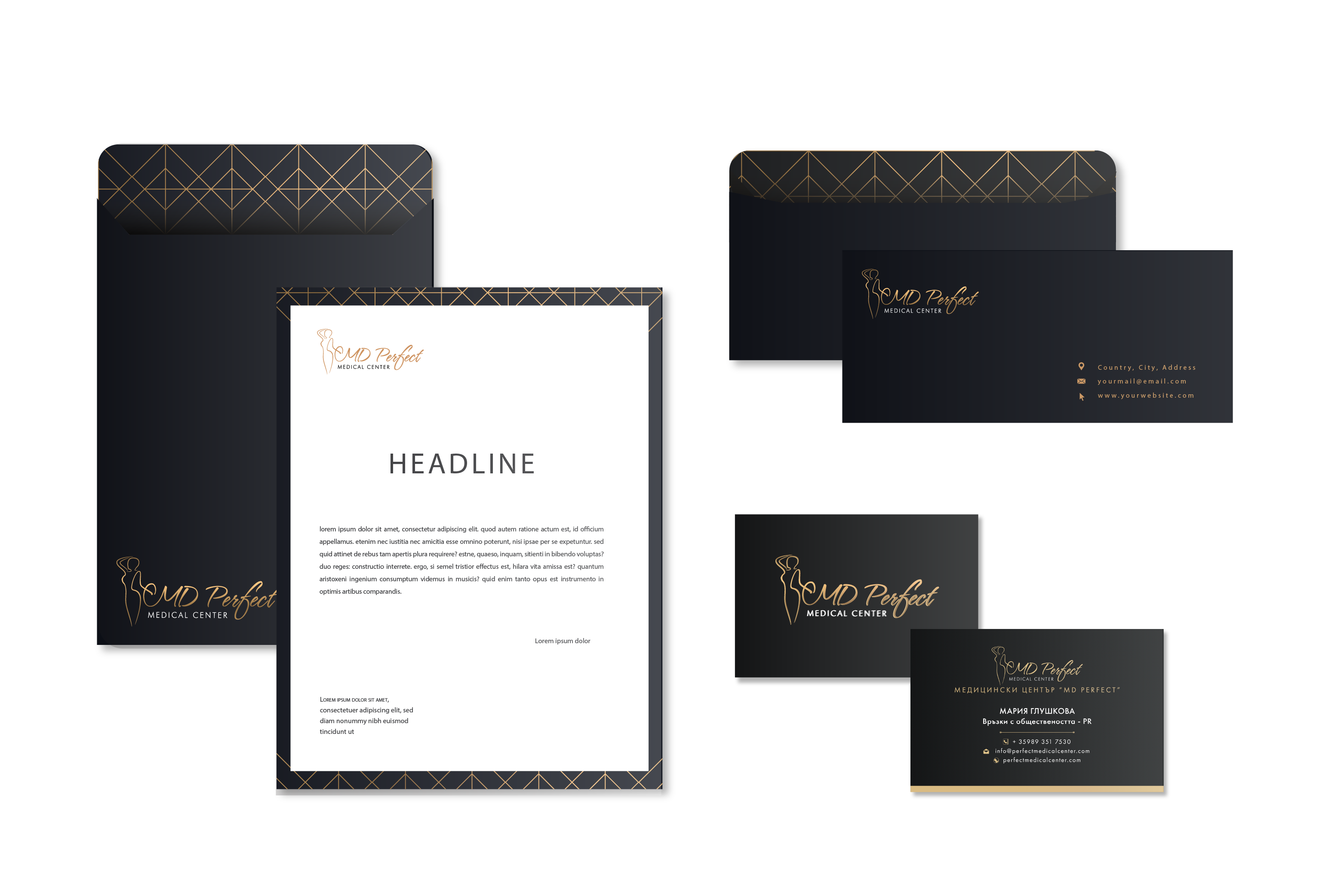
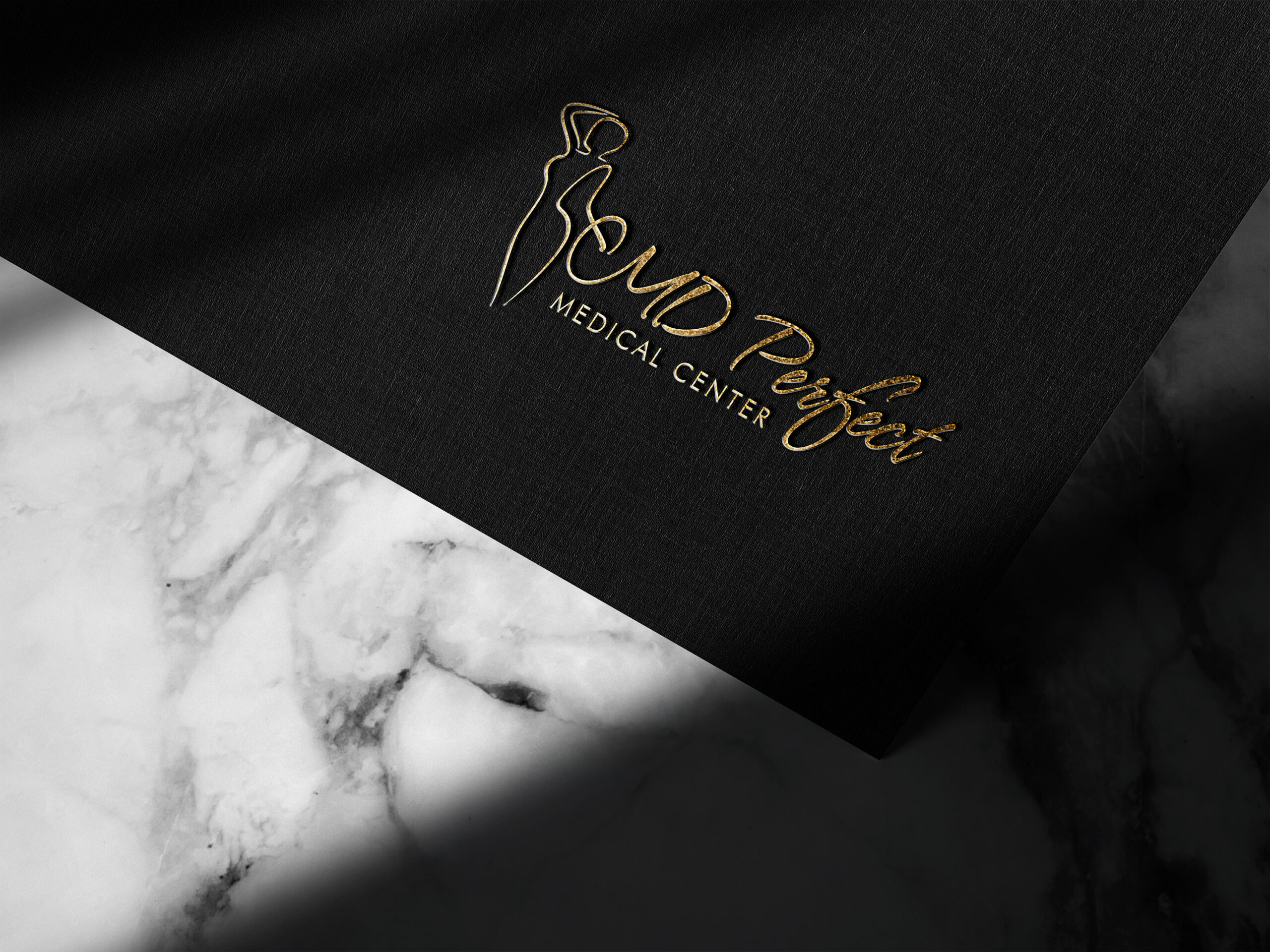
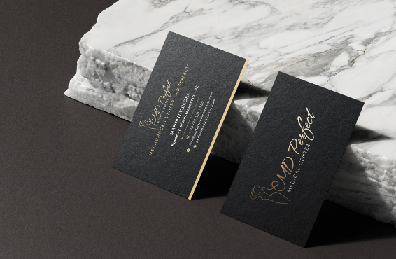
MD Perfect Medical Center is a startup business that needed the development of a comprehensive identity, including a logo, overall stylistics, and a website. There were two requirements that subsequently posed the main challenges: firstly, the logo should incorporate a feminine silhouette and their name, and secondly, the color palette should consist of black and gold.
Firstly, the logo may prove challenging to reproduce in various media and formats, where details of the feminine silhouette could be lost or distorted.
Secondly, the color black may evoke a dark and tragic context, which is not always desirable in the healthcare sector where healing and optimism are promoted.
And finaly, everything needed to be accomplished in the shortest possible timeframe. Understandably, one month in total was allocated for building the logo, corporate identity, website design, and its actual development.
I crafted an adaptive logo designed to seamlessly adjust to various media and devices, maintaining its readability and effectiveness. I established a comprehensive visual corporate identity in the form of a Brand Book, emphasizing professionalism and providing a clear and appealing image that solidifies the brand as sustainable and recognizable. This approach supports successful communication with the target audience, facilitates marketing efforts, maintains long-term identity, and instills trust among consumers.The combination of black, gold, and white is associated with elegance, sophistication, and professionalism. Black conveys seriousness and security, while gold adds a sense of high standards, quality, and attractive design.